
A lightweight React carousel and slider. Smooth touch and mouse dragging, responsive slides, infinite loops and autoplay. Bring your own cards, images or logos; style every part with CSS.


Try the live playground ↗ · Watch the video · API · CSS styling
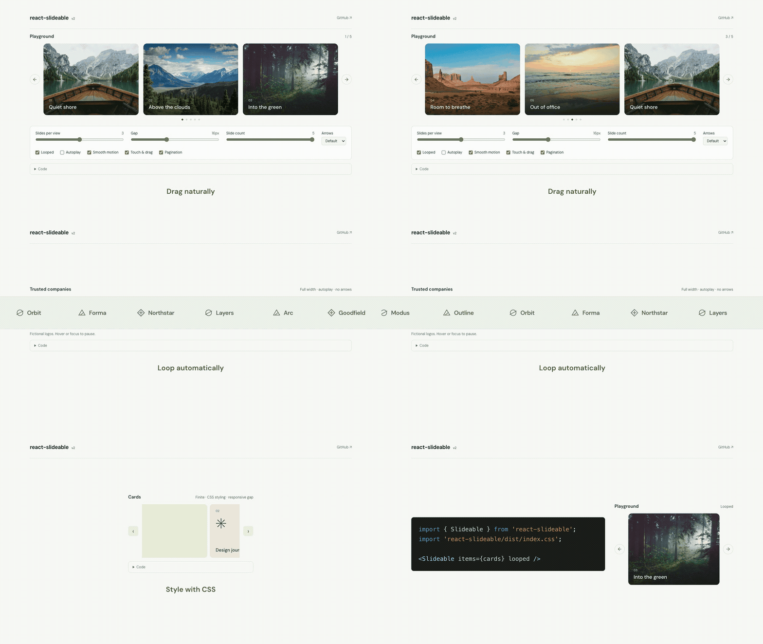
- Zero runtime dependencies. React 18 and 19; TypeScript types included.
- Responsive slide counts based on container width, plus CSS spacing through media or container queries.
- Custom or hidden arrows, pagination, keyboard navigation and reduced-motion support.
npm install react-slideableimport { Slideable } from 'react-slideable';
import 'react-slideable/dist/index.css';
<Slideable
items={photos.map(photo => (
<img key={photo.id} src={photo.url} alt={photo.description} />
))}
looped
slidesPerView={{ 480: 1, 900: 2, max: 3 }}
gap="1rem"
pagination
/>;Give inner images width: 100%; display: block. Carousel controls slide widths.
Responsive keys accept any pixel width, including 768. They are upper bounds on the carousel container width: { 480: 2, 768: 3, max: 4 } shows two slides up to 480px, three up to 768px, and four above that.
items accepts React nodes, so the same component works for an image gallery, product cards, testimonials or a logo carousel.
// Looping logo row without arrows
<Slideable
  items={logos}
  looped
  autoplay={2200}
  controls={false}
  slidesPerView={{ 480: 2, 768: 3, max: 6 }}
  ariaLabel="Company logos"
/>;

// Finite cards with CSS-controlled spacing and custom arrows
<Slideable
  items={cards}
  className="product-carousel"
  slidesPerView={{ 480: 1, 768: 2, max: 3 }}
  previousIcon="‹"
  nextIcon="›"
  ariaLabel="Products"
/>;| Prop | Default | Behavior |
|---|---|---|
items |
required | React nodes. Use stable keys. |
looped |
false |
Wrap in both directions. Empty and single-item lists never loop. |
slidesPerView |
1 |
Positive integer, or upper-bound container-width breakpoints with a max fallback. |
gap |
CSS, then 0 |
Optional override. Number in pixels or CSS length such as "1rem" or "clamp(8px, 2vw, 24px)". |
draggable |
true |
Touch and mouse dragging. Vertical page scrolling and pinch zoom remain available. |
duration |
360 |
Motion duration in milliseconds. 0 disables animation. |
controls |
true |
Show previous/next buttons. |
previousIcon, nextIcon |
arrows | Content inside navigation buttons. Do not nest interactive elements. |
pagination |
false |
Show pagination buttons. |
autoplay |
false |
Interval in milliseconds, minimum 100. Pauses on hover, focus, drag, hidden document and reduced motion. Finite carousels stop at their end. |
slidesToScroll |
1 |
Slides per navigation command. |
initialIndex |
0 |
Initial zero-based index, clamped or wrapped at mount. |
onChange |
— | Settled logical index. Also fires when configuration clamps an existing index. |
onMove |
— | "next" or "previous" when settled index changes. |
empty |
— | Empty-state content. Last measured slide height is retained; supply height for a stable initially empty carousel. |
placeholder |
— | Fill missing slots in finite mode. Decorative and inert. |
height, width |
auto, "100%" |
CSS dimensions. Height applies to slide row. |
keyboard |
true |
Arrow keys, Home and End when viewport has focus. |
ariaLabel |
"Carousel" |
Accessible name. Use a distinct name for each instance. |
className, style |
— | Root styling. |
Responsive counts use carousel viewport width, excluding navigation buttons.
import { useRef } from 'react';
import { Slideable, type SlideableHandle } from 'react-slideable';

const carousel = useRef<SlideableHandle>(null);
<Slideable ref={carousel} items={cards} />;
carousel.current?.next();
carousel.current?.previous();
carousel.current?.goTo(3);
Navigation can interrupt motion. Callbacks report the settled position. Drag release eases to the nearest slide; reduced motion disables animation and autoplay.
Every part has a public class. Scope overrides with the root className to style instances independently. Import the library stylesheet before your own CSS.
<Slideable className="product-carousel" items={cards} slidesPerView={3} looped />.product-carousel.react-slideable {
--react-slideable-gap: 12px;
--react-slideable-accent: #466139;
--react-slideable-button-size: 36px;
}
@media (min-width: 768px) {
.product-carousel.react-slideable {
--react-slideable-gap: 24px;
}
}
.product-carousel .react-slideable__slide {
padding: 8px;
border: 1px solid #ddd;
border-radius: 12px;
background: white;
}
.product-carousel .react-slideable__button {
border: 0;
border-radius: 8px;
background: #eaf0e3;
}
.product-carousel .react-slideable__button--next {
background: #dce8d0;
}Omit gap to let CSS control spacing. Set --react-slideable-gap on the root so track spacing and slide widths stay coordinated. CSS lengths, clamp(), media queries and container queries work. An explicit gap prop sets the variable inline and takes precedence over normal CSS rules. width works the same way; its CSS default is 100%.
| Class | Part |
|---|---|
.react-slideable |
Root; receives your className |
.react-slideable__row |
Viewport and navigation row |
.react-slideable__viewport |
Scroll viewport |
.react-slideable__track |
Slide track |
.react-slideable__slide |
Each slide wrapper, including loop copies |
.react-slideable__button |
Both navigation buttons |
.react-slideable__button--previous |
Previous button |
.react-slideable__button--next |
Next button |
.react-slideable__dots |
Pagination group |
.react-slideable__dot |
Pagination button; [aria-current="true"] is active |
.react-slideable__empty |
Empty state |
.react-slideable__status |
Visually hidden live status |
Buttons expose native :disabled and :focus-visible states. Use controls={false} to remove arrows. Slide wrappers use border-box, so padding and borders fit their allocated width. Keep slide width, flex basis and order under carousel control.
Set height when slides need a fixed height. Keep inner content within its slide width. Layout is horizontal LTR, including on RTL pages.
Three fixed bands provide repeated content. Scrolling rebases into the middle band. DOM, timers and listeners do not grow with each wrap.
Original components keep their state and DOM identity. Buffer copies also mount React content, but are inert and hidden from assistive technology. Keep editable data and side effects outside repeated slide components; controlled content keeps originals and copies consistent during movement. Avoid autoplay media and singleton side effects inside slides.
Rendering is bounded, not virtualized. Visible count is capped at 100. Window very large catalogs before passing them in. Requires modern browsers with Pointer Events, ResizeObserver, CSS scroll snap and inert support. Native wheel scrolling uses browser snapping; touch, mouse and button motion use the configured duration.
npm ci
npm run dev               # http://127.0.0.1:5173
npx playwright install chromium webkit
npm run check             # types, unit tests, package/demo builds, browser tests
node scripts/stress.mjs   # demo server required; heap/DOM/listener checks
node scripts/package-smoke.mjs
Node 22.13+. TypeScript 5.9 supports the declaration builder. Package includes ESM, CJS, declarations and CSS. Demo lives in demo/; npm run demo:build writes demo-dist/. Version 2 uses a new API; v1 props are removed.
MIT © zilijonas. Demo photos from Unsplash.