


The foundations philosophy explains the reasoning in more detail, but the short version is simple: this is a reusable design system for typography primitives, content blocks, the long-form essay shell, token and theme CSS, and the build-time tooling that keeps the baseline consistent. That includes SEO, OG cards, lint rules, and contrast checks.
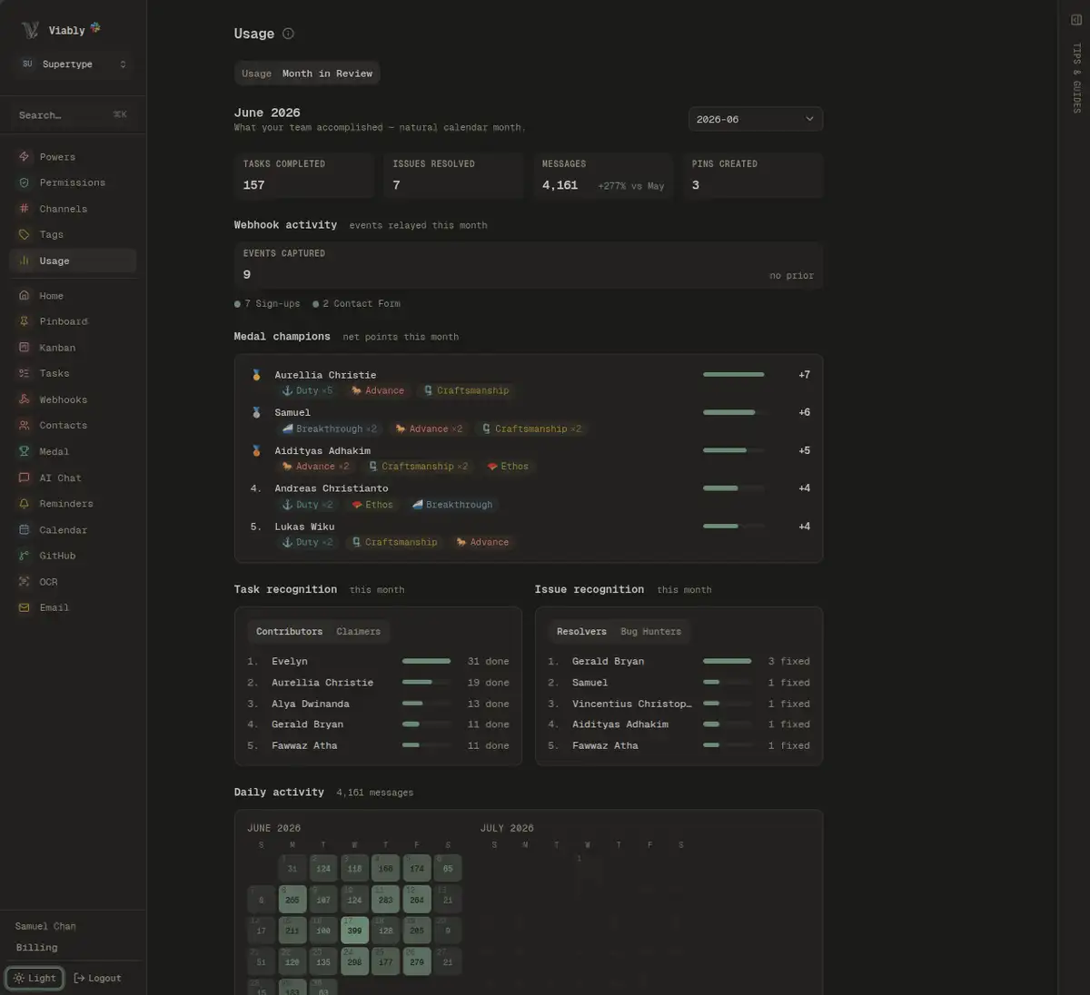
It is used in Supertype projects like Viably work operating system and supertype.ai, and it is MIT-licensed for any Next.js 15+ app built on Tailwind and Shadcn.
yarn add @supertype.ai/foundationsStart here: Install, then Your first page.
Reference: Typography · Blocks · The essay shell · Build-time tooling · The CLI
Working on the package itself: Contributing, for local iteration against a consumer and for releasing.
Like the project? ⭐ Star it on GitHub
Check out: the documentation site, or alternatively run the example site locally:
yarn example:install   # once, to install Next, the peers and the package
yarn example           # then open http://localhost:3000
examples/site renders every component with the code next to it, and includes whole-page recipes you can copy into your project. It also includes the dark and .editorial switches.
This package includes a CLI that writes the CSS for you and checks the rest:
npx @supertype.ai/foundations init      # edits your CSS entry, prints the rest
npx @supertype.ai/foundations doctor    # checks this app against everything below
init edits one file: the CSS entry that imports Tailwind. It adds any missing
imports and reorders the existing ones if needed. Run it with --dry-run first
to preview the patch. It also prints the font bindings and the llms.txt snippet
your coding agent should read.
The steps performed by init are listed below. See the CLI for
the full list of checks and details.
yarn add @supertype.ai/foundations
# or: npm install @supertype.ai/foundations
Peers are Tailwind 4+, React 19+, Next 15+, next-view-transitions 0.3+ and
@base-ui/react 1.4+.
Tailwind v4 is required, not preferred. tokens.css declares
@custom-variant and @theme inline, and the @source line below is v4-only
syntax; on v3 they are parse errors. If you are still on v3, run
npx @tailwindcss/upgrade first —
foundations init will tell you so rather than writing a block your build
cannot parse.
Installing from a git tag instead
Every release is tagged and published, so a commit can be installed directly
when you want to try an unreleased fix. Pin a tag rather than #main: an
untagged git dependency resolves to a different commit on a fresh install.
/* app/globals.css */
@import "tailwindcss";
@import "@supertype.ai/foundations";
That one line carries tokens.css, theme.css, type.css and prose.css in
the order the cascade needs, and registers the package’s own @source so
Tailwind scans the components it ships. You do not need to work out a path or
keep an order: Tailwind v4 resolves @source relative to the file that declares
it, so the package points at its own dist/, correctly, wherever it happens to
be installed.
Add @import "@supertype.ai/foundations/shiki.css"; after it only if you render
code fences.
Importing the parts separately
The granular entry points are still exported and still supported, for the app
that paints every colour role itself and wants tokens.css without theme.css.
Taking them means owning the order and the scan path yourself:
/* app/globals.css */
@import "tailwindcss";
@import "@supertype.ai/foundations/tokens.css"; /* structural tokens + dark variant */
@import "@supertype.ai/foundations/theme.css"; /* the house palette */
@import "@supertype.ai/foundations/type.css"; /* the type ramp + font roles */
@import "@supertype.ai/foundations/prose.css"; /* inline-code rule */

@source '../node_modules/@supertype.ai/foundations/dist/**/*.js';
The @source line is required in this form. Tailwind does not scan
node_modules by default, so without it the package’s classes get purged
and the components render without styles. The path is relative to your CSS file,
so it changes with your layout — and in a workspace, where the package hoists to
the repo root, ../node_modules is not where it lives.
theme.css is required. tokens.css names the colour roles, and
theme.css gives them values. Without it, the colour utilities cannot be
resolved, so the page renders unpainted without an obvious error. It also
carries --secondary-ink, --subtle-foreground, the four earth tones used
for marker highlights, and the accordion-down and accordion-up keyframes.
Skip it only if you declare every role yourself; foundations doctor fails if
neither path is true.
The package cannot load the typefaces for you. next/font runs in your app and
generates hashed variable names at build time, so each app loads the three fonts
and binds them to the roles type.css expects:
// app/layout.tsx
import { Ubuntu_Sans, Ubuntu_Sans_Mono, Average } from "next/font/google";

const sans = Ubuntu_Sans({ variable: "--font-ubuntu-sans", subsets: ["latin"] });
const mono = Ubuntu_Sans_Mono({ variable: "--font-ubuntu-sans-mono", subsets: ["latin"] });
const serif = Average({ variable: "--font-average", weight: "400", subsets: ["latin"] });

<html className={`${sans.variable} ${mono.variable} ${serif.variable} font-sans`}>
Bind with .variable, never .className. A className sets font-family
on the element itself and leaves the roles unresolved, which causes a mismatch
where the page renders one typeface while the font-sans and font-heading
utilities render another.
npx foundations doctorIt reads your CSS entry, your root layout and the installed tree, then reports
on import order, the @source path, the font bindings and the peer versions. It
exits non-zero on a real problem, so it works as a CI step too. Every check and
what it catches is listed in the CLI.
import {
  TypographyH1,
  TypographyH2,
  TypographyProse,
  TypographyEyebrow,
  TypographyLink,
  TypographyCaption,
} from "@supertype.ai/foundations";
import { Card, Cards, Callout } from "@supertype.ai/foundations/blocks";

export default function Page() {
  return (
    <main className="mx-auto max-w-3xl px-6 py-16">
      <TypographyEyebrow>Guides</TypographyEyebrow>
      <TypographyH1 variant="display" className="mt-2 text-balance">
        Getting data out of Postgres
      </TypographyH1>
      <TypographyProse className="mt-4">
        Three approaches, ordered by how much of your schema they need to know.
      </TypographyProse>

      <TypographyH2 divider className="mt-12">
        Approaches
      </TypographyH2>

      <Cards>
        <Card
          href="/notes/logical-replication"
          title="Logical replication"
          description="Row-level changes, no schema coupling."
        />
        <Card
          href="https://www.postgresql.org/docs/current/sql-copy.html"
          title="COPY"
          description="Fastest bulk path. Leaves the app."
        />
      </Cards>

      <Callout tone="warn" title="Before you start" className="mt-8">
        Replication slots hold WAL until they are consumed. An abandoned slot
        fills the disk — see{" "}
        <TypographyLink href="/ops/slots" addArrow>
          slot hygiene
        </TypographyLink>
        .
      </Callout>

      <TypographyCaption as="p" className="mt-8">
        Last reviewed March 2026
      </TypographyCaption>
    </main>
  );
}
Two rules cover most of the API:
- Do not write type styles by hand. A paragraph carrying
text-sm text-muted-foregroundis<TypographyMuted>. Using the primitives keeps a size and a colour from drifting apart across a few hundred call sites. - Retune with CSS variables, not classes. The package owns its own
classnames. Change a
--text-*,--heading-weight, or a colour specification intheme.cssto retune the whole package. Read Tokens and theming for full instructions.
yarn example (above) builds the package, syncs it in and starts the dev
server. yarn example:build is what CI would run.
It installs the package from a git tag rather than the registry and updates it
with yarn sync.
/recipes holds whole pages rather than single components: a marketing hero, a
metrics panel, pricing tiers, a docs page, an article index, and examples of MDX-rendered pages. Each one lives in
app/_recipes/ as a complete file that imports
only from this package, so you can paste it into your app and it compiles.
The package includes an llms.txt with the public API, the rules, and the
mistakes that do not produce an error. Point your agent at it once and it stops
writing text-sm text-muted-foreground where a primitive already exists:
<!-- CLAUDE.md, AGENTS.md, or your agent's equivalent -->

@node_modules/@supertype.ai/foundations/llms.txt
yarn build fails if an export is missing from it, so it cannot fall behind the
package.
| import | contains | docs |
|---|---|---|
@supertype.ai/foundations |
all typography primitives, cn |
Typography |
@supertype.ai/foundations/blocks |
Button, Badge, Card, Callout, Steps, TabGroup, Accordion, SEGMENT |
Blocks |
@supertype.ai/foundations/mdx |
proseMdxComponents — the MDX element map |
In MDX |
@supertype.ai/foundations/essay |
the long-form shell, TOC, reading rail, post meta | Essay |
@supertype.ai/foundations/seo |
createSeo(...) — metadata + JSON-LD |
Tooling |
@supertype.ai/foundations/og |
ogCard, OG_SIZE — an element for next/og |
Tooling |
@supertype.ai/foundations/eslint |
the design rules as ESLint selectors; five ship off until an app has swept for them | Tooling |
@supertype.ai/foundations/rehype |
rehypeProseCode — build-time only |
In MDX |
@supertype.ai/foundations/contrast |
token resolution + legibility checks, build-time only | Tooling |
./tokens.css ./theme.css ./type.css ./prose.css ./shiki.css |
the style layer | Tokens and theming |
foundations (bin) |
init and doctor |
The CLI |
tokens.css names the structural roles and nothing else: --background,
--foreground, --card, --muted, --primary, --border and --ring, plus
the status set. They are named for meaning rather than hue, so a project that
renders success in blue still reads correctly. It holds no values, so there is
only ever one palette in play.
Each status hue ships twice, on the same rule as the categorical tints:
--success, --warn and --info are fills, held to 3:1 against the page
and a card; --success-ink,
--warn-ink and --info-ink are the same hues as text, held to 4.5:1.
--danger ships as an ink only. --destructive keeps shadcn's shape, where
--destructive-foreground is the label printed on the fill — that is what
-foreground means throughout, and -ink means the hue used as words.
checkSignals in @supertype.ai/foundations/contrast measures all of them and fails if any are below the threshold.
tokens.css also binds the dark: variant to the .dark class. Do not skip
that import: Tailwind v4 otherwise follows the OS setting and quietly ignores
your toggle.
theme.css gives those roles the latte and espresso palette, and adds the
editorial inks (--secondary-ink, --subtle-foreground, and the ochre,
terracotta, sage and fig pairs) along with the elevation shadows.
No brand colours in the package. Structural tokens only, with brand colours left to the app. To repaint, override the raw variables after the imports rather than patching the utilities:
:root {
  --primary: hsl(24 60% 42%);
}
.dark {
  --primary: hsl(24 70% 62%);
}type.css names three font roles (--font-sans, --font-mono and
--font-heading) and the weight that goes with the heading face. .editorial
gives the heading role to the serif and drops the weight to 400.
<div className="editorial">…</div> {/* or on <html> for an editorial site */}Heading sizes are a ratio to the body text under them, and the two
surfaces set body at different sizes: 13px in the product, 18px on .editorial. Scope the class to whichever surfaces should be editorial, whether that is a marketing and docs section or the whole site.
- The package owns its final classnames. Retune with CSS custom properties
(the
--text-*,--heading-weight, the colour tokens) rather than by patching classes. A property the package declares is read by the package; if a knob turns nothing,test/tokens-live.test.tsfails on it; that is worse than no knob at all. - No variant props on the MDX map. Elements that MDX renders automatically take no options. No call site exists to make the choice. Components you invoke by hand can have variants.
- Use the platform first, and a library only where it falls short.
Disclosureis a<details>/<summary>pair: no JavaScript, correct before hydration, and available to an MDX author.AccordionandTabsuse Base UI, since animation and managed selection are beyond what the platform gives you. - No brand colours. Structural tokens only, with brand colours left to the app.
- Put structure in CSS rather than the component map. A host framework can substitute its own element and strip the classes off it, but it cannot strip a child combinator. Both the Shiki theming and the inline-code rule rely on this.
Two entry points lost exports. Both had one function doing the work and several more standing beside it, and the extras are what a config got wrong.
/eslint is one function. designRules assembles every rule, so replace
designConfig({ accents, weights }) with your own flat-config entry around it:
{
  files: ["app/**/*.tsx", "components/**/*.tsx"],
  rules: {
    "no-restricted-syntax": ["error", ...designRules({ accents: "the brand tints" })],
  },
}colourRules, typographyRules, linkRules, themeOverrideRules,
surfaceAsInkRules and renamedTokenRules are internal now. Spreading a subset
was how a config came to be running four of the six sets, unaware of the other
two, so the whole set is what the package hands out. typography: false still
drops the type rules for a surface that sets its own ramp.
/rehype is rehypeProseCode and PROSE_THEMES. PROSE_LANGS and
proseCodeOptions are what that plugin is built from rather than things to pass.
New in the same release: CAP_TRIM and ON_FIRST_LINE for lining a mark up with
the words beside it. Button and TabsTrigger apply the trim to their own labels,
so a control lines up without the call site knowing the rule. The third case needs
no export: a mark set inside a run of words takes align-middle, which centres it
on the baseline plus half an x-height at whatever size the run is set in. Reach for
one of the three rather than a top margin, which fits one rung and misses the rest.
Sites running the package:
- supertype.ai — Supertype, a regional-leading analytics engineering and data science consulting firm.
- viably.app — Viably, an observability-first business operating system and CRM for automation-obsessed teams.
MIT. Copyright © 2026 Supertype. See LICENSE.
Published to npm as
@supertype.ai/foundations,
and installable from this repository by tag. The MIT grant covers using,
modifying and redistributing it either way.