
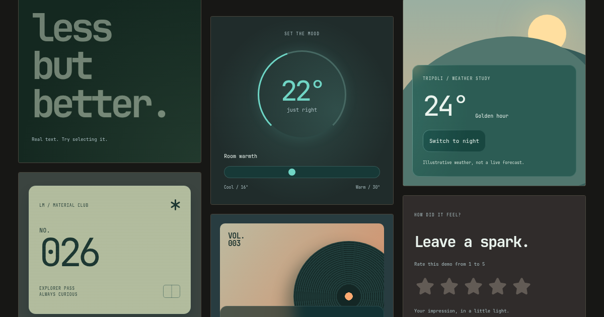
Glass surfaces, glowing borders, and optional pointer light. CSS first, with no core runtime dependencies.


Playground · 24 editable examples · Documentation
With npm and a bundler:
npm install @monabbous/lumenmorph@import "@monabbous/lumenmorph/css";For plain HTML, add the minified CSS to <head> instead:
<link rel="stylesheet" href="https://cdn.jsdelivr.net/npm/@monabbous/lumenmorph@0.3.0/dist/css/lumenmorph.min.css">Both routes use the same markup. Your app supplies spacing and typography:
<article class="lumenmorph lumenmorph-border" style="padding: 2rem">
<h2>Glass & light</h2>
<p>One surface. One optional border pseudo-element.</p>
</article>Static glass needs no JavaScript. Add pointer light when you want the glow to follow the cursor. Installation details cover CDN scripts, self-hosting, and HTML glass text.
The optional Slidebox skin lives in skins/slidebox.css. Import it as @monabbous/lumenmorph/skins/slidebox after Slidebox's styles. The lab, gallery, and editor reuse that same stylesheet, with layout and theme settings only. This namespaced import requires 0.3.2 or later; /slidebox remains a compatibility alias.

| Your project | Guide |
|---|---|
| Plain HTML or any framework | CSS quickstart |
| Tailwind v4 or v3.4 | Variable utilities and variants |
| shadcn/ui | Install Card, Button, or pointer light |
| MUI / Mantine / Taiga UI v4+ | Theme integrations |
| Slidebox switches, radio groups, and experimental ranges | Lab glass skin |
| Sass / Less | Mixins and ready-made classes |
| React / Vue / Svelte / Angular / Web Components | Optional SVG text and icons |
CSS controls · Browser support and accessibility · Contributing
The material owns the surface background and radius; the optional border uses ::before. Blur and gradient painting have a cost—keep large blurred areas in check and test on your target devices.
Using an AI coding agent? Start with the Lumenmorph skill.
Adapted from the glass surface and SVG text approach in nabous.dev.
ISC © Mohamed Nabous. License and credit · Third-party notices